

How colours affect the way you think
A few years ago, a strange trend started to sweep through prisons in Europe and North America. They began painting some of their cells pink. It became so common that in 2014, one in every five prisons and police stations in Switzerland had at least one detention cell that was painted a garish, flamingo pink.
The decor wasn't intended as an aesthetic choice or to make millennial offenders feel more comfortable, but rather to leverage a well-known scientific study from the 1970s. That's when researcher Alexander Schauss persuaded a naval correctional facility to paint a few of its detention cells pink, theorising from his own experiments that the colour might positively influence occupants' behaviour, soothing and calming their agita. The results he achieved suggested he was right – a memorandum written by the Bureau of Naval Personnel stated confines needed only 15 minutes of exposure to the pink cell for their aggressive behaviour and potential for violence to abate. Tests in other detention centres appeared to back up his findings, and once they were published in 1979 and 1981, the shade he used – initially made using a pint (473ml) of semi-gloss red outdoor trim paint with a gallon (4,546ml) of pure white indoor latex paint – began being deployed for its mood-changing properties in jails around the world.
The pink tone – officially designated P-618 but called Baker-Miller Pink by Schauss after the directors of the Naval detention centre he first tested it in – has become known by various names around the world where it has been used, from "Drunk Tank pink" to "cool down pink".
There's just one problem: Schauss' results have never been successfully replicated. "There was a study in 2015, conducted in a proper way under controlled conditions, that didn't find any evidence pink reduces aggressiveness," says Domicele Jonauskaite, a colour researcher at the University of Vienna, in Austria. A study at the Justizvollzugsanstalt Poschwies in Switzerland involving 59 male inmates found that there was no difference between white and pink prison cells on prisoner aggression levels.
Even if the apparent tranquilising affect of "Drunk Tank" pink is in doubt, the readiness with which it was adopted speaks of something deep in the human psyche about the power of colour. And it is perhaps not misplaced either – there is evidence that colour can influence our behaviour in some surprising ways without us realising.
 Pink detention cells grew in popularity due to the belief that the
colour could help to calm aggressive inmates and reduce the risk of
violence
Pink detention cells grew in popularity due to the belief that the
colour could help to calm aggressive inmates and reduce the risk of
violence
For example, some colours can be used to compel us into taking action: see research comparing the number of times a hitchhiker, whose vehicle had broken down, was picked up by passing cars. When the stricken traveller – actually played by one of the research team – wore a red shirt, she was picked up more often than wearing other colours. Red has been shown to generate more immediate emotional responses, though perhaps this is due to what's known as the Berlin-Kay Theory, derived from the work of a pair of US academics in the 1960s. Put simply, they found that red was always the third colour term to evolve in the almost 100 languages they studied, after white and black. The longer a word for a colour was in use, the greater the number of associations, meanings and nuances it can acquire. In this way, the colour itself gains more impact.
Then again, colour can also be deployed to demoralise: one of the locker rooms at the University of Iowa's football stadium was notoriously painted pink – including the urinals – in an attempt to nibble away at the visiting team's competitive spirit – based on Schauss's experiments. Exactly how effective it was is still an open question – the statistics seemed to indicate that while the pink room was in use, the Iowa Hawkeyes had a higher than average home win rate, but there could be many other reasons for that record (they might just have a better team, for example).
Much of the research on how colour can affect human behaviour is contradictory though. Some studies suggest it can influence everything from our mood and emotions to how fast our hearts beat, and even physical strength. Bright shades of red, for example, have been found to lead to higher states of arousal and can even stave off drowsiness. Experiments have also suggested that monotonous tasks like proof-reading can be more effectively achieved in red offices while creative tasks, such as essay writing, are better done in blue rooms. But other work has shown that red and blue can also be distracting when trying to perform tasks. Others suggest that certain personality types, such as introverts, might be more susceptible to external influences such as the colour of their surroundings.
Colour can mess with the way we experience senses such as taste and flavour, or even our preference for music
These contradictions have led some researchers to warn against placing too much emphasis on claims about the therapeutic and psychological benefits of different colours, saying there is still insufficient evidence to support them.
But there are some areas where colour has been found to have a clear influence on our brains. For example, it can mess with the way we experience our other senses, such as taste and flavour, or even our preference for music.
One thing that red seems to convey, fairly consistently, is sweetness. One study of more than 5,300 people from around the world found that red-coloured drinks were most likely to be regarded as the sweetest, no matter where the participants came from.
Marie Wright, chief global flavourist at ADM Nutrition, a multinational food and drink processor, recalls a particular product test for a strawberry flavour the company had devised. Volunteers struggled to detect changes in sweetness as they tested the flavouring. But when Wright and her colleagues brightened the redness of the liquid rather than upping its sugar content, the participants began reporting it was tasting sweeter.
"We found that you can make something feel sweeter if it's brighter coloured," says Wright. "It's just like a bright red apple: before you've bitten into it, you expect it to be sweeter." She says that brightening the colour can trick the brain so much that it has allowed them to lower sugar levels in some recipes by 10-20%, although the results from these tests have not been published in any academic journals to date.
It's important to be cautious around colours and nutrition, though – there is some evidence that colour can alter how we experience food, but not necessarily impact our consumption levels in the long term. Charles Spence, a psychologist at the University of Oxford who studies how our senses interact with each other and author of a book on the science of eating, says much of the crossmodal influences between colour, flavour and mouthfeel come from ingrained social associations we build up during our daily lives. Most of these come from marketing and packaging, he says, but also from our experiences of foods we eat day to day.
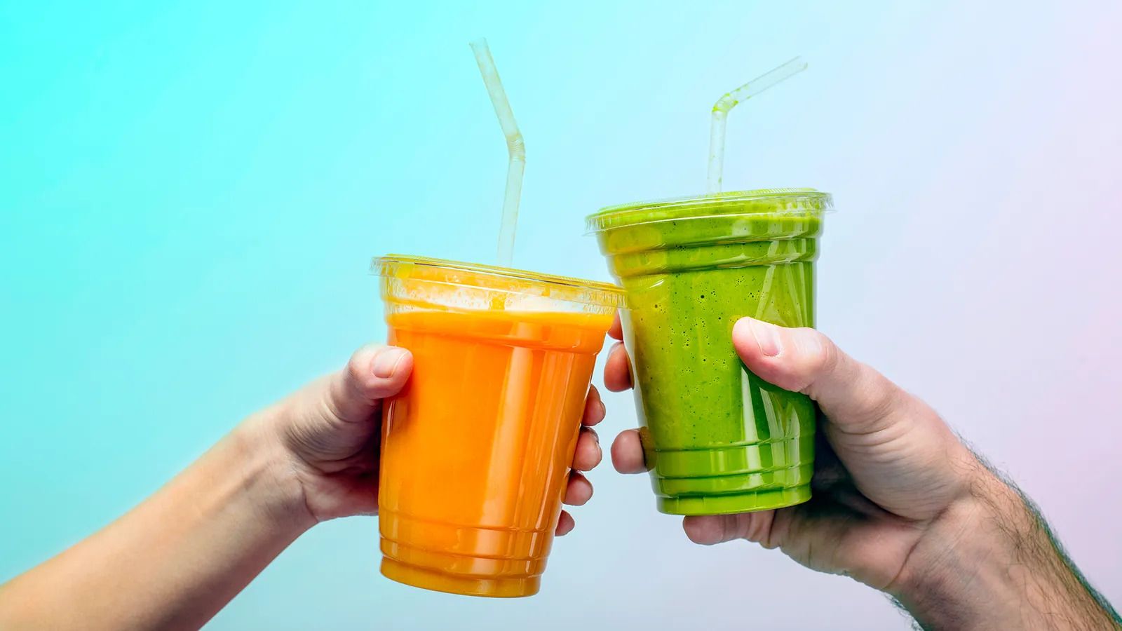 At first sight, one of these drinks will probably have seemed sweeter to you than the other
One thing is clear: we do indeed eat first with our eyes. When we see an artificially coloured product, we confer all sorts of assumptions and expectations on it before it gets anywhere near our mouths. We might expect a bright blue ice lolly, for example, to taste of raspberry because we've been trained to expect that from other ice lollies of that colour we have eaten (interestingly Taiwanese consumers might instead associate a clear blue colour with a mint flavour, while British youngsters would expect a raspberry flavour). And when chefs or food companies play with that automatic association, it can meddle with how we experience the food, says Spence. If the blue ice lolly tastes of orange, it would likely take longer to identify that flavour. Whether it can alter the intensity of the flavour we experience is still somewhat disputed in the scientific literature, with some studies finding an effect, and others not.
Another study looked at how the colour of a wine bottle label influenced the way volunteers perceived the flavour of the red wine within: red and black labels, for example, made it more likely that they would describe the wine as "tangy".
Strangely, colour can convey other types of sensual information too. Imagine an advert for a towel pops up on this page – immediately, the softness is palpable, almost as if you can feel it through the screen. But that perceived plushness might not be down to high thread count you can see on the screen, it might be its pastel colour, at least according to the work of Atefeh Yazdanparast Ardestani, an associate professor in the school of management at Clark University in Worcester, Massachusetts.
"When I close my eyes, and think about softness, certain colours come to my mind – they're usually lighter ones, light pink, light blue," she says. "That was the question I had in my mind: what is the correspondence between our sense of vision and our sense of touch?" Put simply, could colours convey softness or hardness without hands-on experience?
So Ardestani ran some tests. She asked volunteers to write down the colours they pictured when imagining softness and, sure enough, they mirrored her own, skewing towards pale shades. Then she asked volunteers to look at different colours, three at a time: each was at the same saturation, or intensity, but they varied from light to dark. When given adjectives to describe them, in 91.2% of the cases the lightest shade was selected as the softest.
The darker the colour we see, the more intense haptic sensation – Atefeh Yazdanparast Ardestani
Although her findings have yet to be published and are undergoing academic peer review as part of a larger scientific study, she cites similar work with Turkish and Lebanese volunteers that produced similar findings. Ardestani studied American volunteers, so if her results stand up to scrutiny, it suggests that softness may be a structural association with lighter colours rather than a semantic, or linguistic, one. "The darker the colour we see, the more intense haptic sensation," she says. In evolutionary terms it could be that darker colours served as some sort of warning to our ancestors, "priming them to be safe", Ardestani speculates.
Ardestani's broader work focuses on consumer decision-making, so she wanted to see how these findings might be leveraged outside the laboratory. Again, she devised a test, this time asking volunteers to look at products on a screen in pairs – each the same colour, but one much lighter in shade. Those products were deliberately items where haptics, or touch, might prove important in purchasing decisions – think towels, bedsheets, sofas.
"We noticed that yes, the colour lightness results in higher anticipated softness, which translates into higher purchase intention." Volunteers were also willing to pay more for the objects they perceived as being softer.
What appears to be happening is that our brains are using colour as a visual signal to compensate for touch. And it is employed to great affect by those who want to sell us stuff – toilet roll, for example, is usually protected from our hands by plastic packaging in supermarkets, but is almost always a light pastel shade.
"90% of our initial product assessments are based on colour," adds Ardestani.
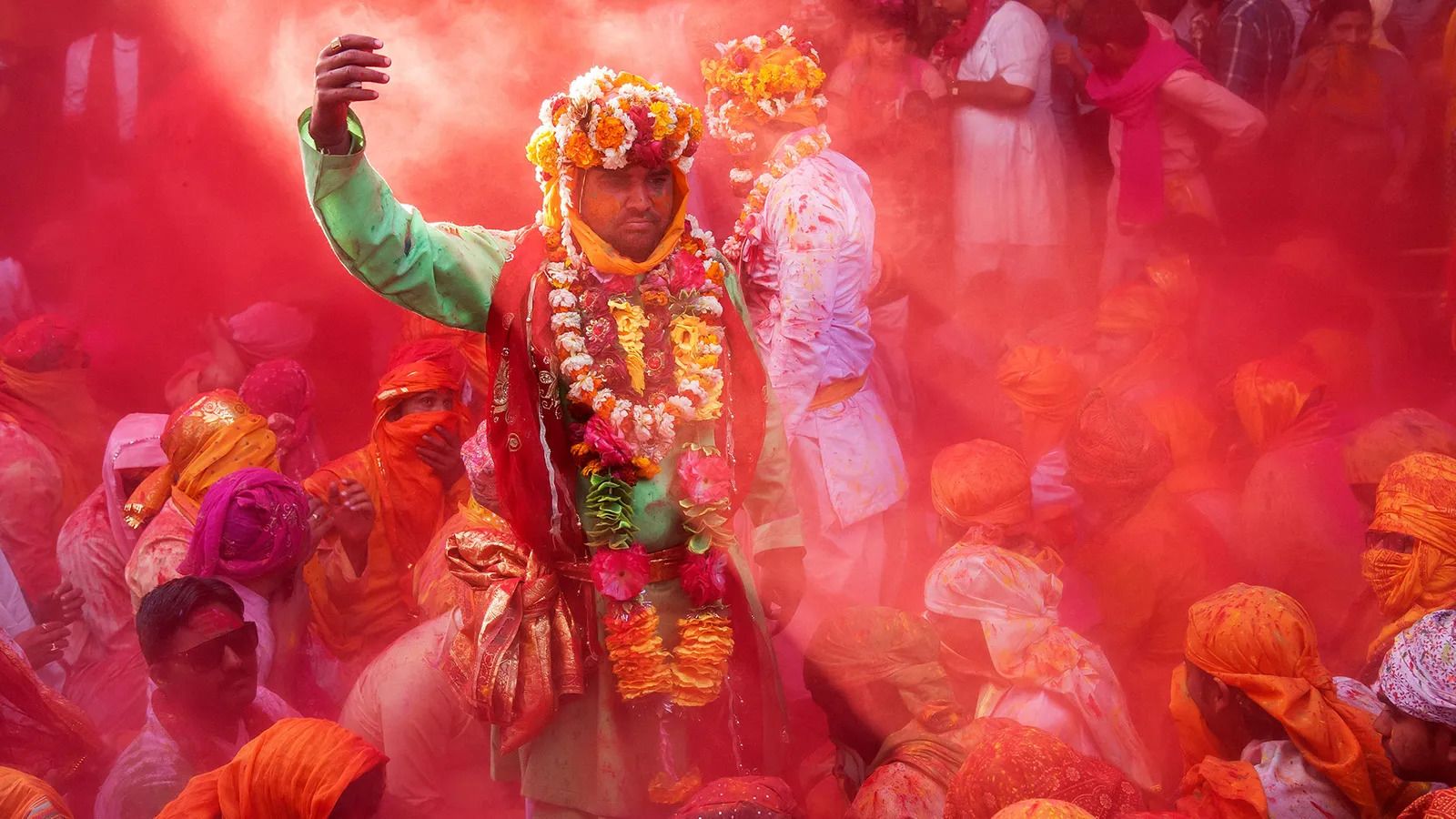 Colours can often have special significance and meaning in some cultures
But while pale shades may suggest softness, colour intensity suggests quantity, according to Karen Schloss, a psychologist at the University of Wisconsin-Madison and one of the world's foremost colour researchers. She has helped to devise the ecological valence theory for why we favour certain colours over others. She points to legends on data graphs, or maps: the colours chosen – more specifically, their intensity – might be intended to use that association to manipulate how you interpret that information. "People infer that darker colours map to larger quantities, which has been used very well in most of the pandemic maps I've seen – more cases, or fatalities, represented with darker colours," she says, citing her own work as well as that of others on how we're behaviourally conditioned to make that link.
Associations like this can lead to problems, Schloss warns. If data is presented in a way that uses lighter colours for larger quantities, it can lead people to misunderstand what they are seeing. If a map comes up on a screen for a split second, "you're going to interpret dark is more, not light is more", even if that isn't what the data really shows, she says.
But Schloss has also shown that colour can be used for good too – such as encouraging better civic behaviour. Her recent research has delved into the meanings we ascribe to colours. "We wanted to understand how people's association with colour influences their expectations – so we could anticipate them, and design to match them, and so make it easier to interpret," she says.
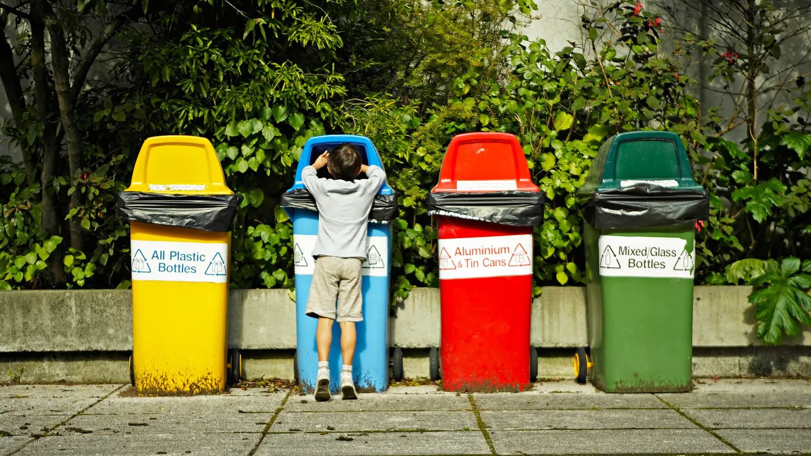 Colours are often used to help convey information about which recycling bins rubbish should be sorted into
She and her colleagues used recycling bins as the basis of a particular experiment.
Imagine six such bins, identical in size and shape, but each earmarked for a different category with signs that read "glass", "metal", "compost" and so on. Schloss posited that changing the colour of a bin might subtly telegraph its purpose, helping to streamline behaviour and minimise mistakes in sorting. When she and her team showed volunteers images of six differently coloured bins and asked to label them as they saw fit, a pattern emerged. Some colours were closely associated with a category: browns and yellows instantly suggested trash, for example. Others, though, were more weakly associated: red, for instance, didn't instantly evoke any category. There was, however, a slight preference to label red bins with "plastic" when asked to choose among the six.
The meaning of colour, then, is contextual, Schloss continues. A single white bin might obviously suggest paper, while a single red bin would mean little. Taken together, though, a series of six differently coloured trash cans can play off each other, and communicate far more, and more subtly.
Other studies have shown that colours can directly impact performance, especially among children. When eight- and nine-years-olds conducted a series of tasks in the presence of different shades, academics found their overall performance was significantly worse around red versus grey, which was used as a baseline. And forget blue-sky thinking, try green-space thinking – at least if one study into creativity is credible, which showed a correlation between creativity among children and the presence of that colour, or objects of that colour such as plants. And if you want a child to concentrate, you might consider painting a classroom in a vivid palette and so bolster their reading scores.
"It all suggests colour is far more powerful than we thought," says Schloss.