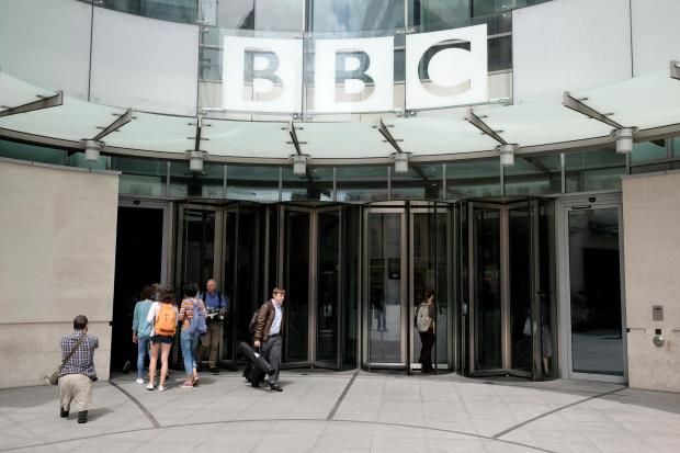
BBC blows tens of thousands on new logo which looks virtually identical
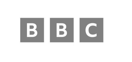 The Beeb has splashed out taxpayers'
money to design a new logo, pictured here, but it doesn't look any
different to the existing logo
The Beeb has splashed out taxpayers'
money to design a new logo, pictured here, but it doesn't look any
different to the existing logo
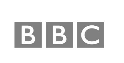 Despite the changes to the iconic 'BBC
blocks' being minuscule, picture here is the existing logo, costs are
thought to be in the tens of thousands of pounds
Despite the changes to the iconic 'BBC
blocks' being minuscule, picture here is the existing logo, costs are
thought to be in the tens of thousands of pounds
Costs are thought to run into tens of thousands of pounds.
But the changes to the three iconic “BBC blocks” are minuscule.
They include using a different, smaller font — bespoke BBC Reith, named after Beeb founder John Reith.
The trio of blocks are also slightly further apart.
The logo was quietly unveiled on the website of streaming service BBC Select in February. It is thought to be hitting our TV screens in the autumn.
TV analysts Clean Feed said: “It looks like a badly executed mock-up of the current logo.”
 TV analysts Clean Feed said: 'It looks like a badly executed mock-up of the current logo'
They added that the Beeb would find it “difficult to explain away an expense like this, for such an inconsequential change”.
The BBC said: “We are using our own font — which we own the intellectual rights to — when we update content or BBC products.
“It would be wrong to suggest the costs of the design of the blocks was significant.”